Ever been handed a chunk of content so hefty, it feels like you've just been passed the secret tomes of a lost civilization? I'm talking about those sprawling epics of text that seem to recount every detail since the invention of the steam engine.
We’ll skip the obvious solutions such as splitting those into more pages or simply shortening the text and concentrate on typographical (and graphical) ways of dealing with such a beast.
There are different ways to keep readers engaged for large portions of text, similar to speech techniques which add rhythm and emphasis.
Before starting your paragraph formatting exploration, it’s necessary to take a closer look at what your objectives are, as not all techniques are suitable for all cases. And, of course, keeping in mind the medium you are working with is vital since designing for print and screen is largely different.
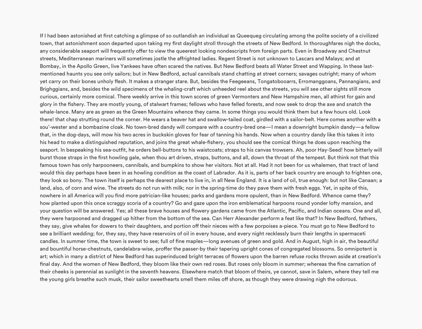
Here we have an example of an unformatted wall of text. It takes the whole width of a page and lacks distinctive elements that emphasize, draw attention or impose a rhythm. Text formatted without any distinctive elements is generally considered unreadable (try to read it if you have any doubts).
Let’s try to fix this by adding visual and spatial elements that add clarity and distinctiveness to portions of text.
Paragraphs
The first thing we can do to break up text is dividing it into paragraphs. Shorter sentences and paragraphs keep the reader engaged and makes your content more scannable.
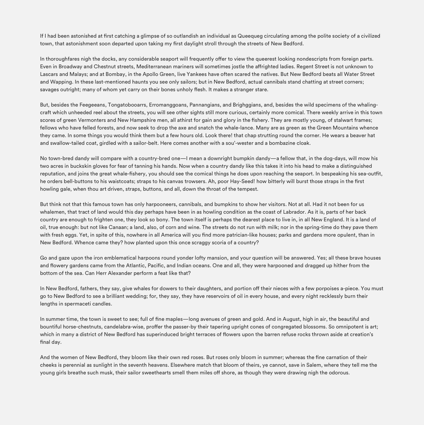
Much better. There is a hint of the structure through the text now.
Columns
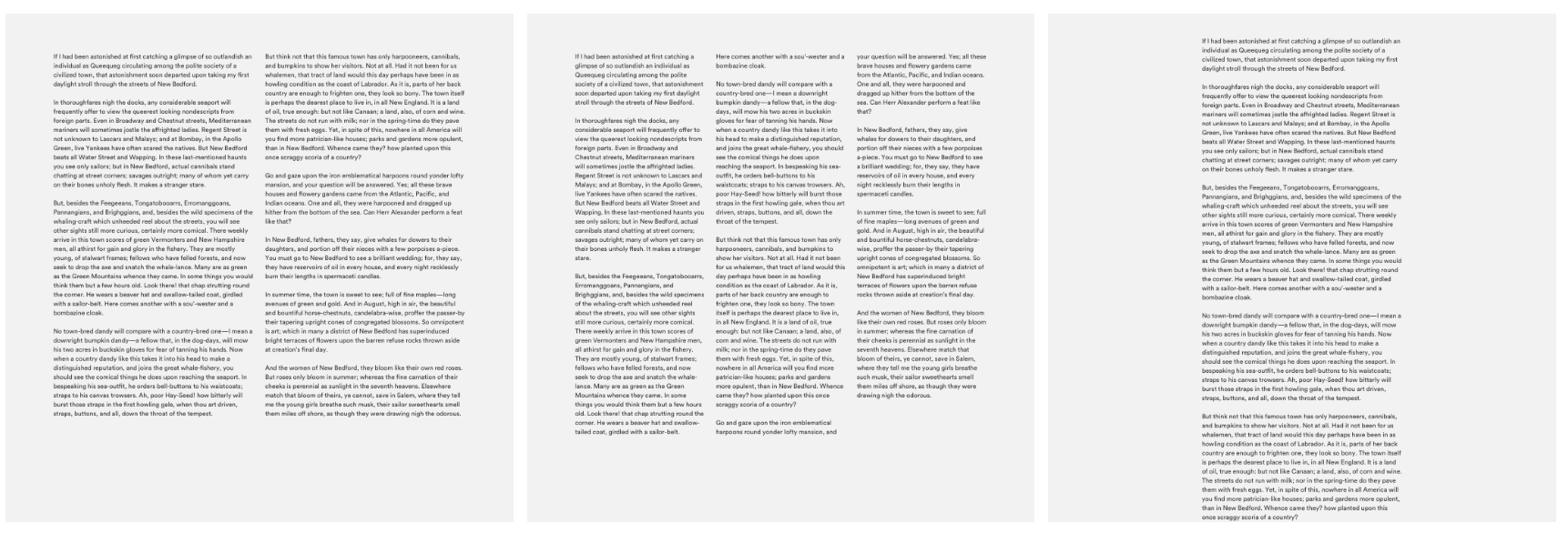
Paragraphs did a good, however, really long lines make it harder for the eye to find the next line while reading. The total length of a paragraph is called “line length”. We usually use characters for line length measurement.
The ideal length of a single line is considered to be 45–75 characters long. The ideal line length is achieved by dividing the blocks into columns or simply squeezing one column to the desired width.
With lengthy reading, a multi-column layout is not very practical for screens since a user could be forced to scroll below the viewport to reach the end of one column only having to return to the top and continue at the beginning of the second column.
Now we’re getting somewhere. The text is much easier to read than the one we started with.
However, there are quite some more things we can use to make this layout even more interesting.
Drop Caps
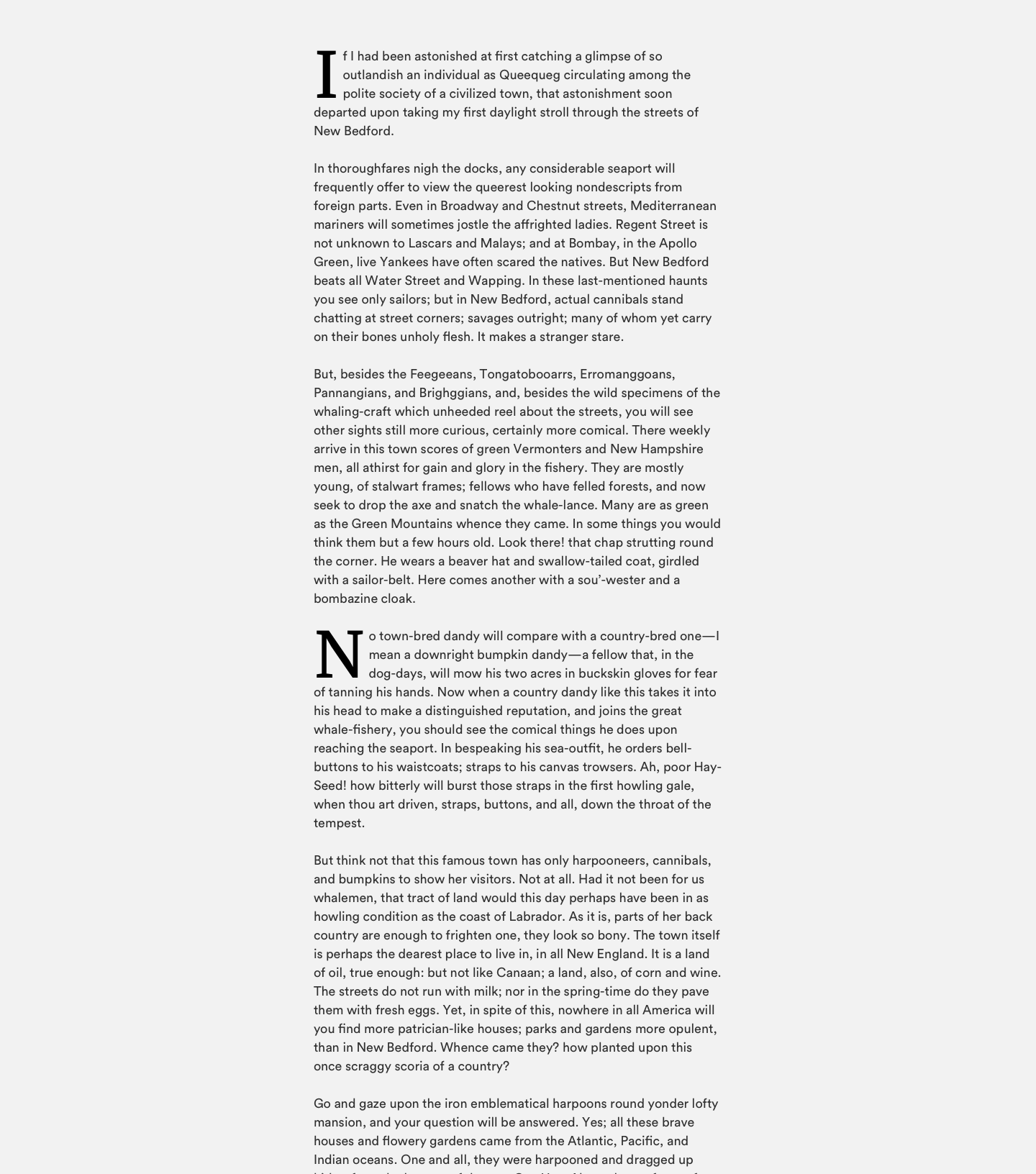
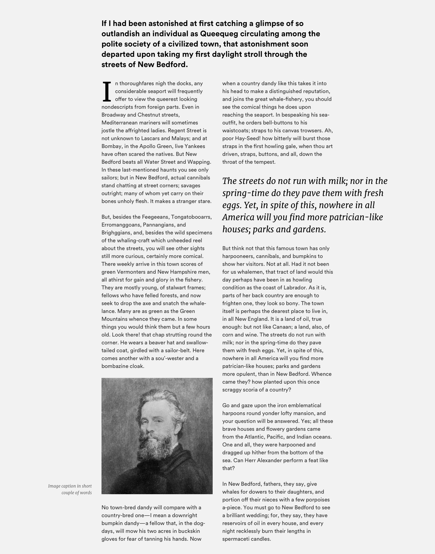
Drop Caps are traditionally used to indicate the beginning or resumption of a text section. They are created by emphasizing the color, size, or style of the first letter of a paragraph. Here we have an example of how to use them in large portions of text.
Great for starting a block of text or a section and are stylish.
Fleurons and flourishes
Fleuron (or Hedera) is a typographic element used either as a punctuation mark or as an ornament inside pages. They are usually displayed as forms of flowers or leaves; that’s where the very term originated (old French: floron meaning “flower”). They come in different shapes and sizes — as full horizontal dividers, paragraph marks (pilcrows), space break symbol, flourish, etc. And as mentioned they are primarily used as a paragraph divider or an element inside the typographic composition.
Titles and subtitles
Using titles and subtitles in a large wall of text includes editing of the source material since they usually symbolize the start of a chapter or a larger portion of text. They are to be used in places that make sense (duh!).
Generally speaking, titles and subtitles belong to the primary and secondary level of typography respectively and are nuggets of scannable information that help readers stay with the design. The design of these text blocks is on the large side, compared to the tertiary level of typography (actual body text).
Quotes
A pull quote is a quotation or excerpt taken (pulled) from the text and displayed inside layout in a graphic way. Its purpose is twofold: to attract attention by offering a teaser intended to draw the reader into the piece, as well as to break up text-heavy content.
Quotes are a part of the secondary level of typography hierarchy — along with elements such as subheads, captions, and other small blocks of text that add information to the primary level of the text.
This is a quote.
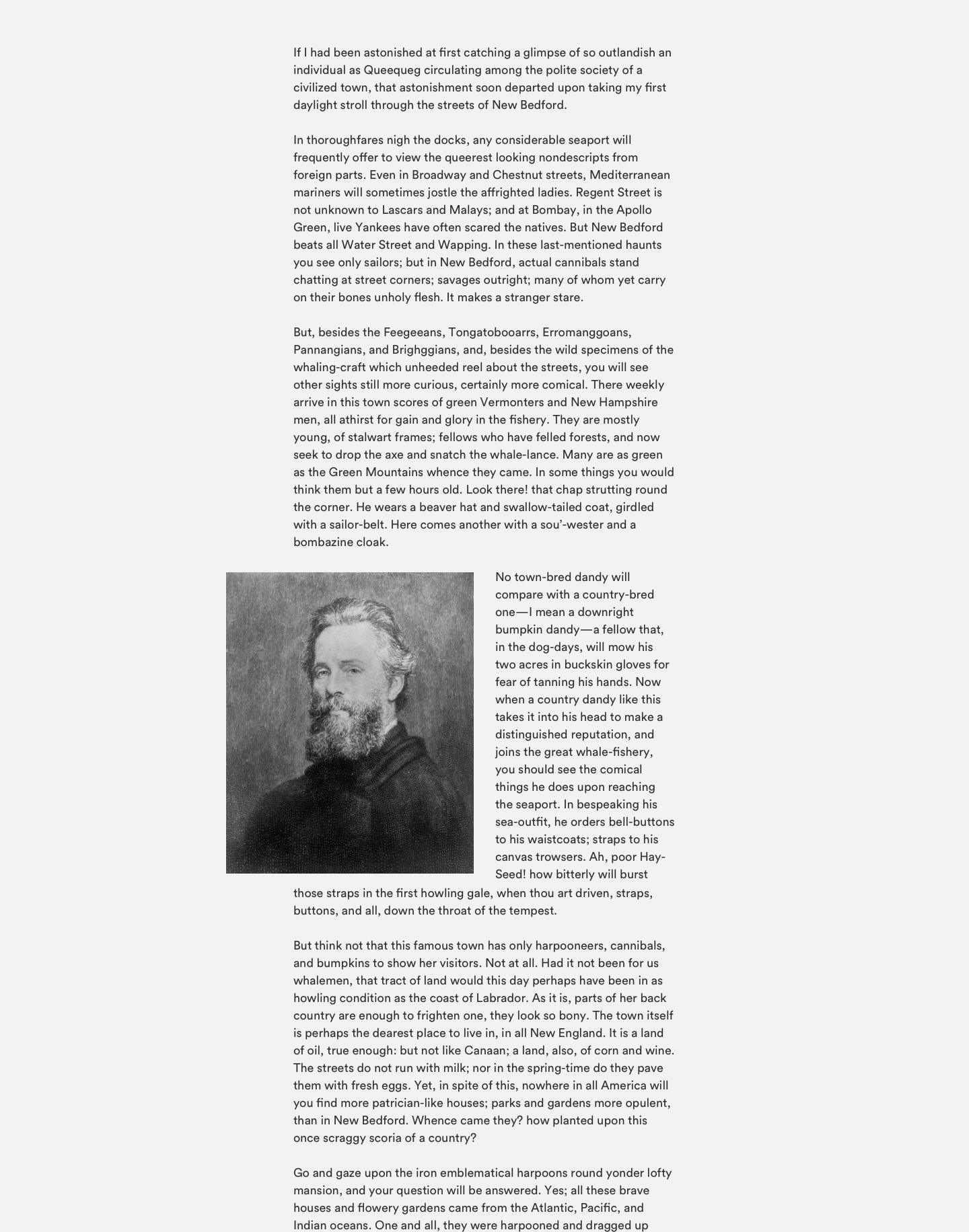
Images
Photographs, graphics, animations, infographics, and other visuals are all great tools in keeping the reader engaged. Those are one of the most common (and natural) ways to break up long texts. In most cases, you’ll want to make sure to leave a good, clear space around image for your text (unless you are trying to achieve that “breaking the rules, grid, and readability” look, but that’s another article).
Combination of above
All of the above are good ways to break up long and boring text but they usually work best when used in combination with each other. You can experiment with images, quotes, drop caps and other graphical and typographical elements to achieve interesting and appealing design and composition. A word of the wise—adding too many elements and you run the risk of actually drowning out your content. And trust me—I went through Geocities phase.
Conclusion
There’s more to text than just breaking it up into paragraphs. It’s about how it looks on the readers’ screen or page and the way it’s presented and arranged.
Always design text for rhythm, visual appeal, readability and general text usability.
Interested in working with us? Want to say hello? Drop us a line at hello@prototyp.digital. We are always on the lookout for new projects and talented people.