Welcome back to our "Designing Complex Interfaces" series. After covering Variables and Styles, we're now exploring Figma Components, a crucial element in creating efficient and consistent designs.
💡 Design system Workflow: Variables → Styles → Components
Understanding Figma Components
Figma Components are reusable elements that form the building blocks of your design system. They act as templates for design elements, allowing you to create a main component (often referred to as the "master") and then use instances of it throughout your design. The key advantage?
When you update the master, all instances update accordingly, ensuring consistency and saving time.
Key Aspects of Figma Components
Consistency and Efficiency:
- Maintain design coherence across projects
- Create once, use multiple times, saving significant time
Flexible Control:
- Easy simultaneous updates across all instances
- Override properties in instances while preserving core design
Improved Collaboration:
- Team members use consistent elements, ensuring design alignment
Learning and Complexity:
- Initial learning curve to understand best practices
- Risk of overly complex nested components without careful management
Performance Considerations:
- Large numbers of complex components may impact file performance
Example Application: Creating a Button Component
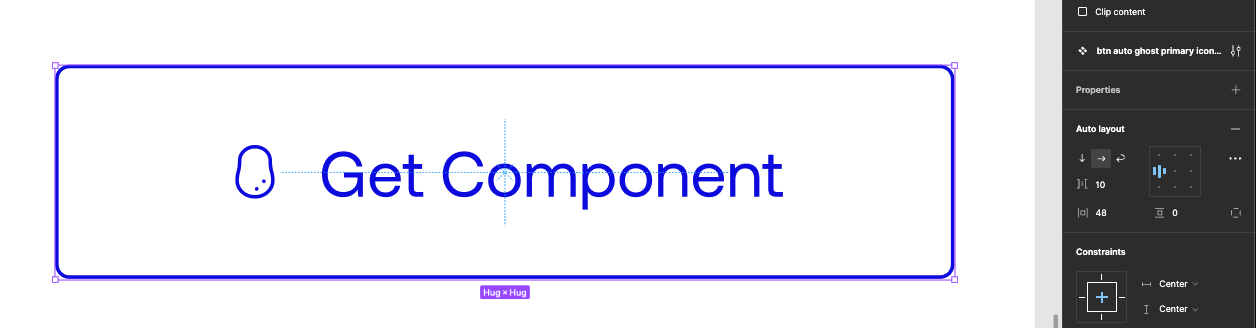
Let's walk through the process of creating a button component, a common and versatile element in many interfaces. Our example will use a simple button with an icon and text.
Note: This button uses Auto Layout, which we'll explore in depth in our upcoming article. For now, just know that Auto Layout helps create flexible, responsive components.
Create the master component:
- Design a button with an icon and text. In our example, it's a blue rounded rectangle with a circular icon and "Get Component" text.
- Select all elements of your button and click the "Create component" button in the top bar.
- Name your component clearly, such as "Button/Primary/Default".
Define properties:
- In the Properties panel, create properties for elements you want to be easily changeable:
- Text: Make the button text a property.
- Icon: Create a property for the button's icon.
- Fill: Create a property for the button's background color.
Use your component:
- Drag your new button component from the Assets panel onto your canvas to create instances.
- Try changing the text, icon, or color properties in these instances. Notice how you can make these changes without affecting the master component.
Update the master:
- Make a change to the master component, such as adjusting the corner radius or padding.
- Observe how all instances update to reflect this change, while maintaining any custom property values you set.
Create variants (if needed):
- With your button component selected, you could add variants for different states like "Hover" or "Disabled".
- For each variant, adjust the appearance as needed (e.g., darker fill for "Hover", muted colors for "Disabled").
This button component example demonstrates the power of Figma components: you can maintain consistency across your interface while still allowing for necessary variations and easy updates. The use of properties allows for flexible customization of instances.
The Interplay of Components, Variables, and Styles
As we've progressed through this series, we've covered Variables, Styles, and now Components. Let's explore how components interact with variables and styles to create a robust, flexible design system.
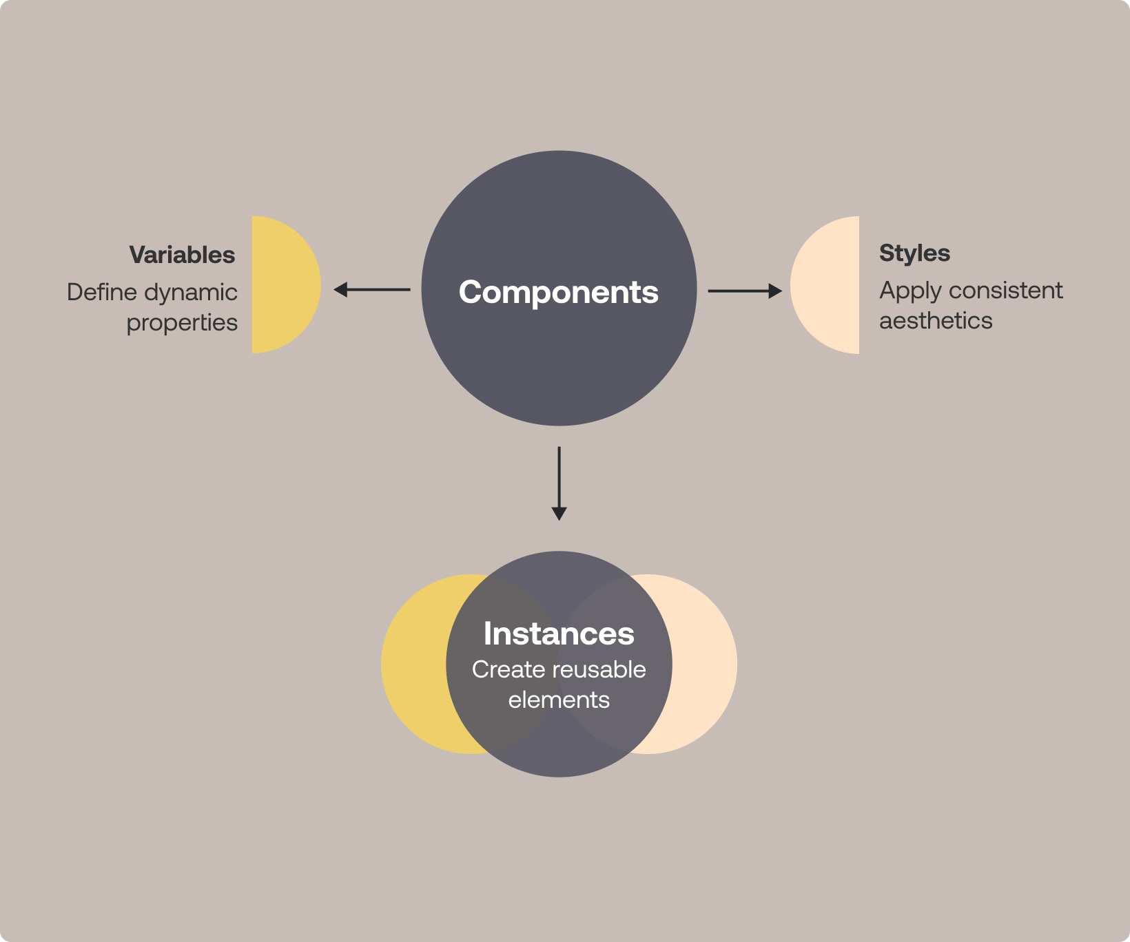
→ Variables can be used within components to create dynamic, easily updatable designs.
→ Styles can be applied to elements within components, combining the reusability of components with the consistency of styles.
Pro Tips for Working with Components
- Plan your component structure: Outline your component organization before implementation.
- Use descriptive names: Opt for detailed names like "Button/Primary/Large" for clarity.
- Leverage variants: Use variants for related components with shared properties but visual or functional differences.
- Be selective: Not every element needs to be a component. Focus on frequently reused elements.
- Organize your library: Use the Assets panel to create a structured component library.
- Document your components: Add descriptions to help your team understand how and when to use specific components.
- Utilize instance swapping: This feature allows you to swap one component instance for another, facilitating quick design iterations.
- Regular audits: Periodically review and refine your components as your design system evolves.
To conclude Mastering Figma Components
You now have a notion on how to effectively use Figma Components in your design workflow but mastering this skill takes practice and experimentation. Figma components are a powerful tool for creating consistent, efficient, and flexible designs, especially when combined with the Variables and Styles we discussed in previous articles.
In our next article, we'll explore Auto Layout - a powerful feature for creating adaptive designs. We'll look at how Auto Layout can work in conjunction with components to create even more robust and flexible design systems.
Keep designing, innovating, and expanding your skills. We look forward to continuing this journey with you in our next installment!
Here’s what to expect in this series:
- Variables: Learn how to use Variables to maintain consistency, ensure scalability, and keep your designs organized.
- Styles: Combine variables into styles for easy property application to an element.
- Components: Understand how to create reusable design elements to maintain uniformity across your project.
- Auto Layout: Find out how to create designs that automatically adapt to different screen sizes and how to optimize space usage. Coming up!
By the end of this series, you should have practical knowledge to make your design process and your workflow work for you better.