This article is the second part of the "Designing Complex Interfaces” series, where we explore essential Figma features. The focus is on Figma Styles. Another core building block to a UI Kit or a design system.
Design system Workflow: Variables → Styles → Components →
Let’s continue with the series with the second part of the workflow: Styles.
Understanding Figma Styles
Figma Styles are predefined sets of design attributes (such as colors, text, and effects) that you can apply to elements in your design. They help maintain consistency and streamline the design process by allowing you to reuse the same styling across multiple components.
Benefits:
- Consistency: Ensures uniformity in design elements throughout your project.
- Efficiency: Saves time by reusing predefined styles instead of manually setting properties each time.
- Scalability: Makes it easier to update designs globally. Changing a style updates all instances where it’s applied.
- Organization: Keeps your design system organized by centralizing style definitions.
Drawbacks:
- Initial Setup: Requires upfront time to define and document styles.
- Learning Curve: May require training for team members unfamiliar with design systems.
- Maintenance: Needs regular updates and management as your design system evolves.
Figma lets you organize your local text, color, and other styles using the "/" naming convention and folder hierarchy. This is easily done just by typing for example “Text/Large”. It makes it easy to navigate and reorganize when needed.
Styles can be grouped by type (Text,Color, Effect, Layout grid).
Local styles are styles that exist in the current file. As opposed to the styles that reside in a specific library, outside of the document.
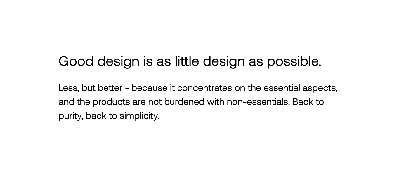
Example Application: Creating Styles for Title and Paragraph
In this section, we'll walk you through the process of creating and applying styles for typography. Specifically, we'll focus on defining variables for text size and line height for two distinct text elements: a title and a paragraph. We’ll reuse the variables created in the first part about Figma variables.
Step1: Creating Styles for Title and Paragraph
Identify the Text Elements:
The title and the paragraph require different typographic settings.
Define Styles:
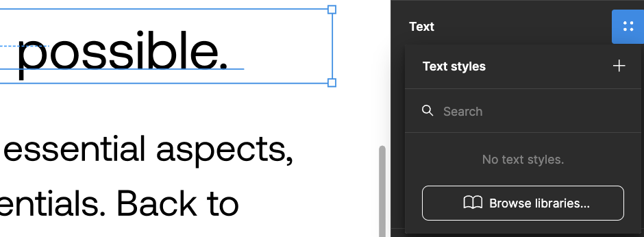
- Select the Text Element: Click on the text element you want to style (title or paragraph).
- Open the Styles Panel: In the right-hand sidebar, find the “Text” section.
- Create a New Style: Click the four-dot icon next to the “Text” section and select “Create Style.” (The plus button)
- Name the Style: Give it a meaningful name, like “Text/Large” and “Text/Base.”*
- Set Typography: Use the already existing variables for font size and line height.
Depending on your needs for styles in your design system you can follow the example and have a complete and easy to maintain design system.
Figma styles are key to creating consistent, efficient design systems. By adding styles to libraries, you create a central source of truth for typography, colors, and effects. This ensures updates spread automatically across all files, maintaining uniformity.
They allow you to quickly use shared elements, saving time and reducing inconsistencies.
Pro Tips for Using Figma Styles
Use a clear naming convention
Adopt a consistent naming system for your styles, e.g., 'Category/Subcategory/Variant'.
Create a style guide
Maintain a dedicated page in your Figma file that showcases all your styles for easy reference.
Utilize color styles for both fill and stroke
Apply color styles to both fills and strokes to ensure consistency across your designs.
Leverage style hierarchies
Use style hierarchies to create variations. For example, create a base text style and then variations for different sizes or weights.
Regularly audit and update styles
Periodically review your styles to ensure they're still relevant and update them as needed.
Use local styles for project-specific elements
For elements unique to a specific project, create local styles instead of adding them to your main library.
Communicate style changes
When updating styles in a team setting, communicate changes to ensure everyone is aware and can update their designs accordingly.
These tips will help you use Figma styles more effectively, leading to more consistent and efficient design workflows.
Further, integrating styles into libraries creates a powerful framework for consistent design across projects. Our future articles will cover best practices for managing Figma libraries as well. Stay tuned and thanks for reading.
Here’s what to expect in this series:
- Variables: Learn how to use Variables to maintain consistency, ensure scalability, and keep your designs organized.
- Styles: Combine variables into styles for easy property application to an element.
- Components: Understand how to create reusable design elements to maintain uniformity across your project.
- Auto Layout: Find out how to create designs that automatically adapt to different screen sizes and how to optimize space usage. Coming up!
By the end of this series, you should have practical knowledge to make your design process and your workflow work for you better.