Ever tried tweaking an icon in Figma, only to have it break your entire component? Maybe it scales weirdly, changes color when it shouldn't, or just refuses to behave — Yeah, we've all been there.
A messy icon library can turn even the best-designed UI into a nightmare. But when set up properly, icons work seamlessly within your design system, scale perfectly, and stay consistent across all components.
In this guide, we’ll break down the best way to source, format, organize, and implement icons in Figma — so you can build an icon library that actually works (and doesn’t make you want to pull your hair out).
Where to find icons (without wasting hours searching)
Before you start setting up your icon library, you need solid icons that actually fit your design.
Figma makes it easy to bring icons into your project, and you’ve got a few great options:
- Figma plugins – Save yourself some time with plugins like Iconify or Material Symbols. They let you drop in icons instantly without leaving Figma.
- External icon libraries – If you need something more specific, check out Nucleo, Heroicons, or Lucide. These sites offer both free and premium icon sets.
- Custom icons – Sometimes, the best option is to create your own. If your project needs a unique look, designing icons directly in Figma gives you full control over style and consistency.
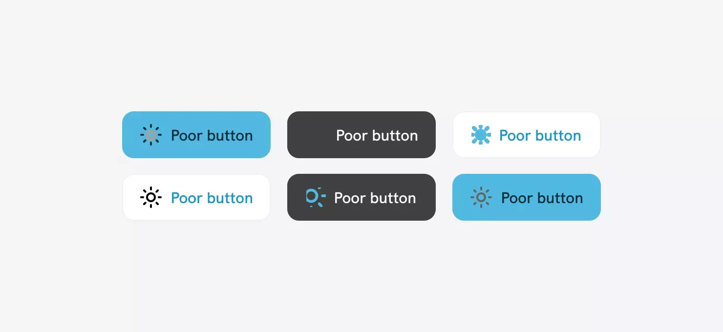
Keep your icons consistent!
Mixing different icon styles is a one-way ticket to a messy, unpolished UI.
Outline, glyph, monochrome, dual-tone — they all have their place, but pick one style and stick with it. Otherwise, your design starts looking all over the place.
Best icon format: Why SVG is the way to go
If you want clean, scalable, and flexible icons in Figma, SVG is the way to go.
Here’s why:
- Scales perfectly – No pixelation, no weird blurriness. SVG icons stay crisp at any size.
- Easy to tweak – Want to change the color, stroke, or size? No problem—SVGs are fully editable in Figma.
- No annoying backgrounds – SVGs come with a transparent background, so they blend seamlessly into any design.
- Lightweight & efficient – Unlike bulky raster images, SVGs keep your Figma file clean and fast.
What to avoid?
- PNG & JPEG – These are great for photos, but terrible for icons. They don’t scale well and can’t be easily customized.
- Messy SVGs – Not all SVGs are optimized. If you’re importing from other tools, clean up unnecessary metadata and groups to keep your library neat.
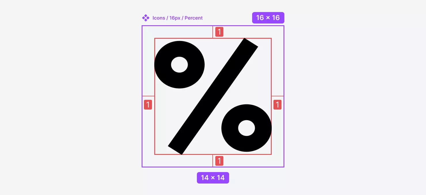
Getting icon containers right (so everything stays aligned)
Icons may be small, but misalignment issues can make your UI feel off. When you drop an SVG into Figma, it usually lands inside a square frame — but the actual vector inside might not be perfectly centered or evenly sized. That’s where icon containers come in.
To keep your icons structured and easy to swap, follow these simple rules:
- Always use square containers – Stick to a consistent size (like 24x24px or 16x16px) so icons align properly across components.
- Center the vector – Make sure the actual icon sits right in the middle of the frame for perfect alignment.
- Maintain even padding – Leave equal spacing around each icon to avoid visual imbalance when swapping different icons.
Taking a few extra minutes to set this up saves you from constant nudging and resizing later — and makes your design system way more polished.
For example, let’s say you’re designing a 16px icon. You’ll want to:
- Place it inside a 16x16px container for consistency.
- Size the actual vector to around 14x14px or 14x12px, leaving a bit of padding around it.
- Adjust as needed — some icons might need a little more breathing room to look visually balanced.
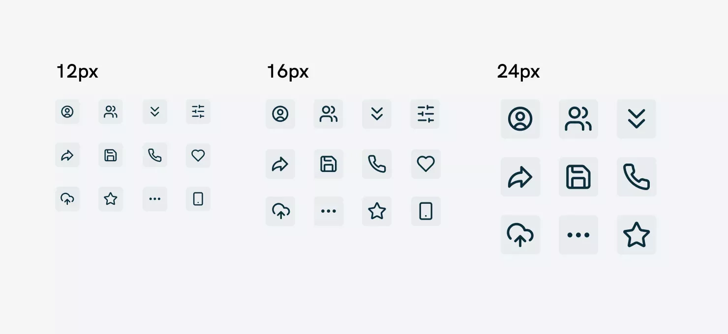
Common icon sizes in UI design
Not all icons are designed equal — different UI elements call for different sizes. Here are the most commonly used ones:
- 12px – Tiny icons for labels, input fields, and subtle UI elements.
- 16px – The go-to size for buttons, toolbars, and navigation.
- 24px – Used for more prominent elements like menu icons and cards.
- 48px & 64px – Perfect for modals, banners, and feature highlights.
Don’t just resize icons randomly. Instead, create variations designed for each size to maintain clarity and detail. Smaller icons should be simple and readable, while larger ones can include more details.
Keeping icons within consistent containers and predefined sizes ensures they swap seamlessly in your UI without breaking layouts.
Choosing the right stroke weight
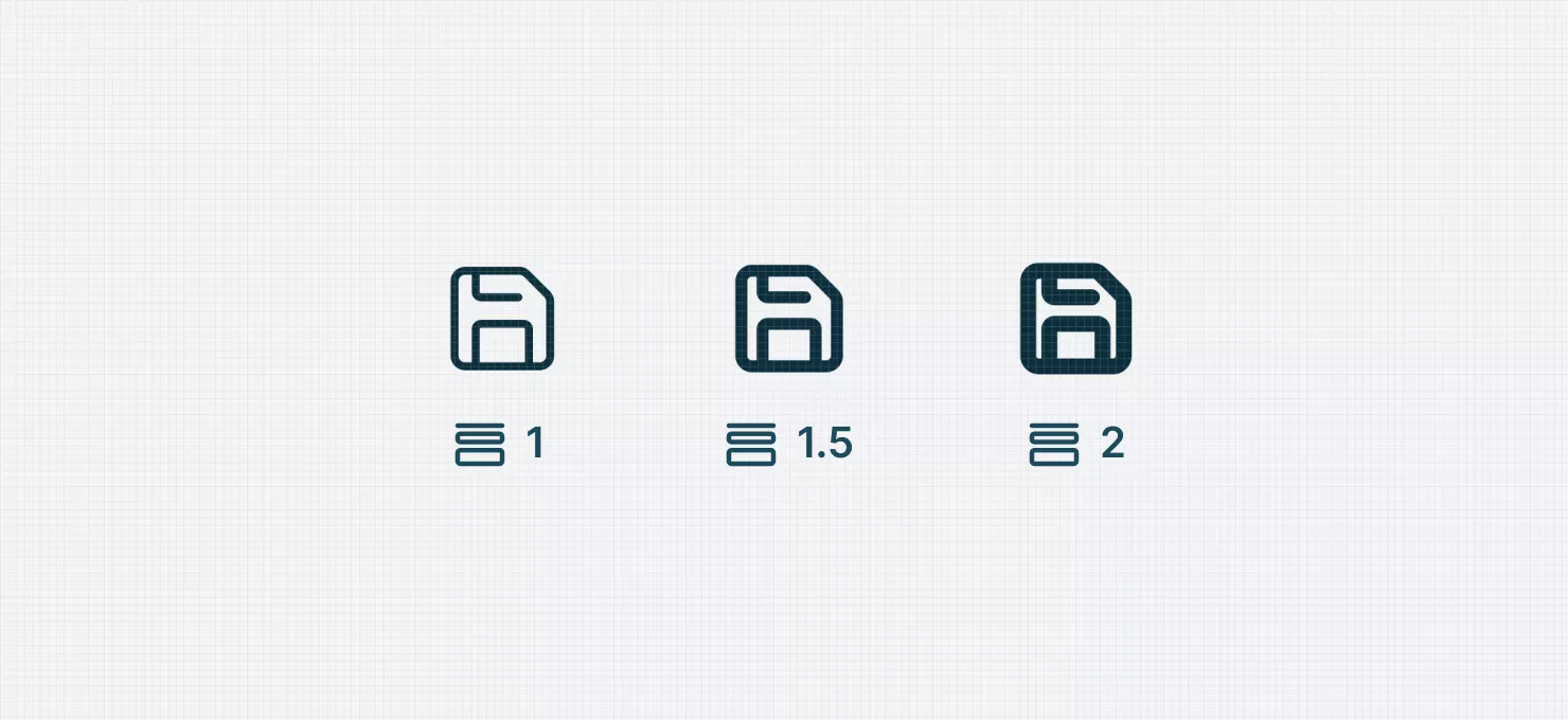
Getting stroke weight right is key for legibility and consistency. Especially across different screen sizes.
For years, whole-number strokes (1px, 2px, etc.) were the norm. But with high-resolution and Retina screens, fractional stroke values (1.5px) have become a game-changer.
When to use 1.5px strokes?
- A 2px stroke can feel too bold.
- A 1px stroke can look too thin.
- 1.5px strikes the perfect balance — crisp, readable, and adaptable across screens.
Choosing the right stroke weight keeps your icons looking polished no matter where they appear.
Does a decimal stroke cause issues?
Some designers worry that fractional stroke values (like 1.5px) can look blurry on older, non-Retina displays since those screens struggle to render half-pixel details.
But here’s the reality: modern high-DPI screens have made this a non-issue. Big players like Google, Mozilla, and IBM are already using decimal stroke values in their design systems, proving they work just fine in scalable UI design.
So, unless you’re designing specifically for outdated displays, decimal strokes are a solid choice.
Recommended stroke weights for scalable icons
To keep icons looking visually balanced at different sizes, adjust stroke thickness accordingly:
📏 16x16px → 1px stroke (best for small UI elements)
📏 24x24px → 1.5px stroke (ideal for buttons and navigation)
📏 32x32px → 2px stroke (great for larger, more detailed icons)
This method helps maintain a consistent visual weight across all UI elements, so your icons look crisp no matter their size.
Beware of blurry small icons (subpixel problems are real)
Ever noticed small icons looking a little fuzzy, especially on older screens? That’s subpixel rendering at work — a technique meant to smooth curves but one that often struggles with straight lines, leading to half-pixel blurriness.
Even though SVGs are scalable, they’re not immune to this issue.
They stay pixel-perfect at their original size, but once resized (especially to non-multiples of the original size), subpixel anti-aliasing can make them appear soft and imprecise.
How to keep icons sharp
There’s no magic fix, but these best practices will help:
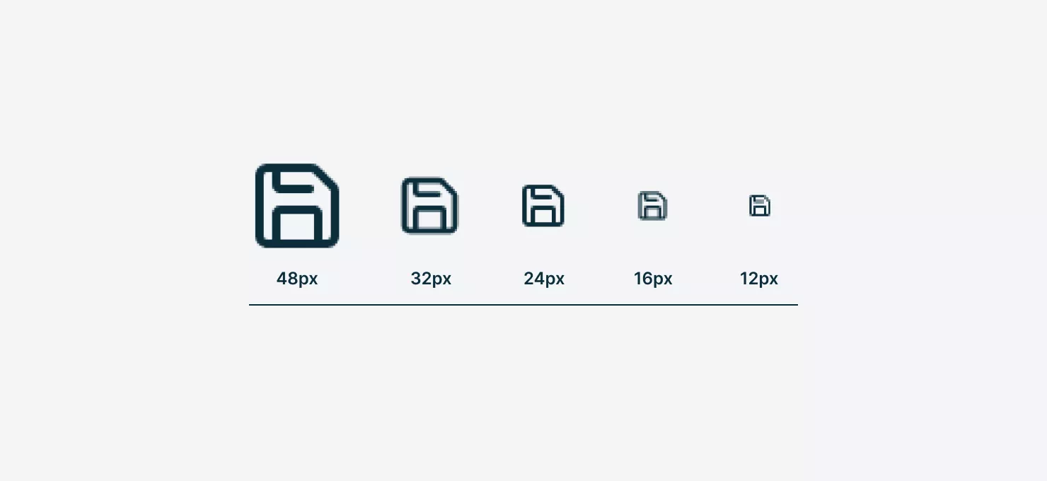
- Design icons at base sizes (12px, 16px, etc.) and only scale in multiples (e.g., 12px → 24px → 48px).
- Test across screens – Different displays handle anti-aliasing differently, so always check how your icons look on various devices.
- Use PNGs for ultra-small icons – When sharpness is non-negotiable, exporting as PNG (instead of SVG) can help maintain clarity.
Follow these tips and you’ll reduce blurriness and keep your icons crisp, no matter where they appear.
Keeping icon properties consistent (so they work seamlessly in UI components)
A well-organized icon library serves one great purpose — making sure every icon behaves predictably in your design system.
Here’s how we keep things consistent.
- Match stroke weights – If you're using outlined icons, make sure all strokes have the same thickness. No mix-and-match allowed.
- Standardize colors – Stick to a single base color (like black, gray, or a specific brand color) to keep everything cohesive.
- Keep spacing & alignment even – Icons should be visually centered within their containers, so they don’t look misaligned when swapped in UI components.
- Set icons to “Scale” under Constraints – In Figma, select the icon inside its frame and set resizing behavior to Scale in the Constraints panel. This ensures the icon resizes proportionally inside different UI elements.
Turning icons into components (the right way)
Now that your icons are properly sized and formatted, it’s time to convert them into components. This step is crucial for scalability, efficiency, and making your design system future-proof.
Best practices for icon components
To ensure your icons work smoothly in Figma, stick to these guidelines:
✅ Use single vectors for simplicity
- If your icon is made of multiple vector shapes, convert them into a union. This keeps all parts editable but ensures uniform styling.
- Alternatively, flatten the icon into a single vector (⌘ + E on Mac, Ctrl + E on Windows) for better consistency.
✅ Skip variants — use smart naming instead
- Avoid creating icon variants—they can slow down your project and make searching harder.
- Instead, use slash-separated naming (e.g.,
Icon / 16px / User) to keep things organized. Figma automatically groups them for easy access.
✅ Name frames & vectors properly
- Name each icon component based on what it represents (e.g.,
User,Search,Settings,Arrow-Left). - Inside each component, name the vector elements "Icon" or "Vector"—Figma will recognize them consistently when swapping icons.
Taking the time to set up icons correctly from the start makes your design system cleaner, faster, and easier to maintain. This will save you (and your team) from endless headaches down the line.
Use slash-separated naming for easy organization
Figma automatically groups components when you use slashes ( / ) in their names, making your icon library way easier to navigate.
Here’s a simple, structured approach:
Icon / 12px / UserIcon / 16px / UserIcon / 24px / User
This setup keeps icons organized by size and function, so you can quickly find and swap the right icon inside components — without scrolling through a messy list.
Keeping your icon library organized
Once your icons are properly named, the next step is structuring them for easy access and consistency.
Here’s how to do it right:
- Create a master icon library – Store all icons in a dedicated page or file, so your team can quickly find and reuse them.
- Group by size – Keep icons of the same size together (e.g., all 16px icons in one section, all 24px icons in another). This makes swapping and maintaining consistency effortless.
- Use Auto Layout – Set up Auto Layout to keep icons evenly spaced and neatly arranged. This makes browsing the library much smoother.
Why this matters
Properly named and organized icons will:
- Speed up your workflow – No more digging through messy files to find the right icon.
- Ensure consistency – Everyone on your team uses the same icons, keeping designs cohesive.
- Prevent design system chaos – As your library grows, a structured approach saves you from future headaches.
Taking the time to set up your icon system now means smoother, faster, and more consistent design work later.
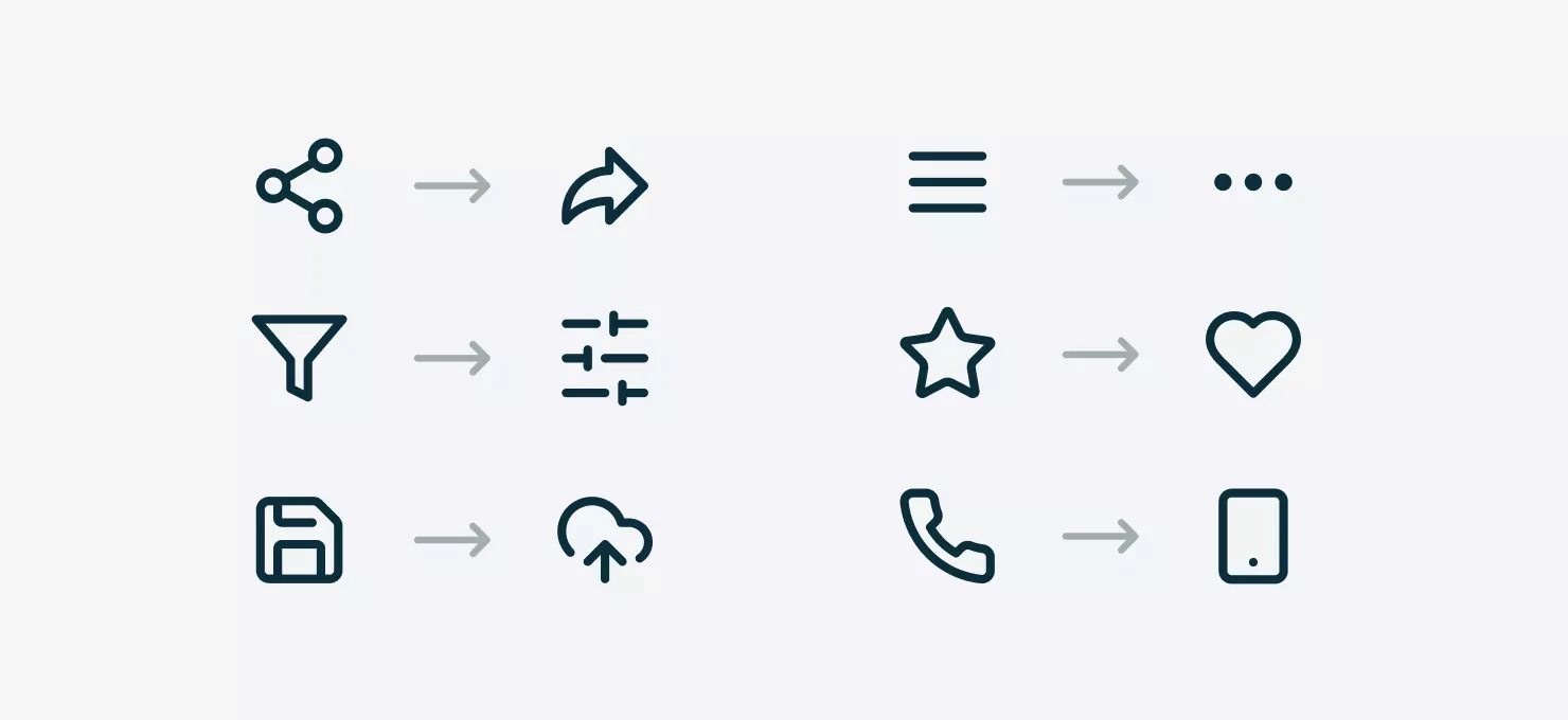
Bonus tip: How icons evolve with technology and user behavior
Icons mirror how technology, user habits, and cultural norms shift over time. As digital products evolve, some icons become outdated and get replaced with more intuitive alternatives.
Here are some classic examples of icon evolution:
- Filter icon – The old water funnel is being swapped for adjustment sliders, reflecting modern filtering systems.
- Share icon – The traditional “share” nodes icon is giving way to a forward arrow, which better aligns with how people think about sharing content.
- Favorite icon – Once represented by stars, hearts have taken over — thanks to social media platforms normalizing them.
- Hamburger menu – The classic three-line menu icon is increasingly replaced by three dots ("more options"), especially in mobile interfaces.
- Save icon – The floppy disk (RIP) is being phased out in favor of a cloud or sync icon, since most files are stored online now.
Want to dive deeper? Check out Vitaly Friedman’s LinkedIn post on icons that might be outdated by 2025.
Key takeaways for a bulletproof icon library
A well-structured icon library can make or break your design workflow.
Get it right, and your icons will be easy to find, swap, and scale. Get it wrong, and you’ll be stuck dealing with overrides that don’t work, misalignment headaches, and inconsistent styles.
To build an efficient and scalable system, focus on these core principles:
- Consistent icon sizing & containers – Keep all icons inside uniform square frames (e.g., 16x16px, 24x24px) with properly centered vectors to prevent misalignment.
- Clear naming conventions – Use a structured naming format (e.g.,
Icon / 16px / Search) to keep your icons searchable and easy to swap in UI components. - Vector optimization – Convert icons into single vectors or unions to ensure smooth overrides and prevent color inconsistencies.
- Style & stroke consistency – Stick to uniform stroke weights to maintain a polished, cohesive look across your design system.
- Scaling rules & constraints – Set icons to “Scale” in Figma’s constraints panel to keep proportions intact and avoid distortion when resizing.
Once you lock in these fundamentals, everything else — scaling, component setup, and organization — will fall into place effortlessly. Nail these steps, and you’ll have an icon library that actually works for you, not against you.