This article is the first part of the "Designing Complex Interfaces” series, where we explore essential Figma features. Our first focus is on Figma Variables. A core building block to a UI Kit or a design system.
💡 Design system Workflow: Variables → Styles → Components → Instances
Let’s start with the first part of the workflow: Variables.
Understanding Figma Variables
Variables store reusable design values like colors, typography, spacing, etc. Their primary benefit is providing a single source of truth (SSoT) that ensures consistency across your designs.
The benefits of using variables include efficiency and speed, reusability, consistency, global updates, and scalability.
There are drawbacks but they are manageable and don’t significantly detract from the overall advantages. Most potential issues can be mitigated with careful planning, proper training, and clear documentation.
Variables are easily managed in the “Variables” panel. Here, you can create, edit, organize, and apply variables to your design components.
To access the Variables panel:
- Use the menu by going to View → Panel → Toggle Variables, or
- Click on a the “Local Variables” section in the properties panel when the page is selected.
Example Application: Creating Variables for Title and Paragraph
In this section, we'll walk you through the process of creating and applying variables for typographic properties in Figma. Specifically, we'll focus on defining variables for text size and line height for two distinct text elements: a title and a paragraph.
Step1: Creating Variables for Title and Paragraph
Identify the Text Elements:
We have two text elements: the title and the paragraph. These require different typographic settings.
Define Variables:
We'll create two sets of variables for text size and line height: "Base" and "Large."
Before we dive into creating variables, it's important to understand the concept of design tokens. Design tokens are the basic, reusable elements such as colors, typography, spacing, and more, which define the visual properties of your design system. In Figma, these design tokens are managed as variables.
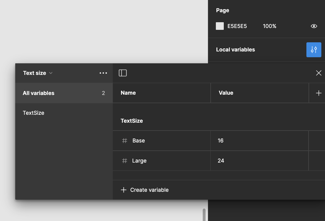
Create Text Size Variables
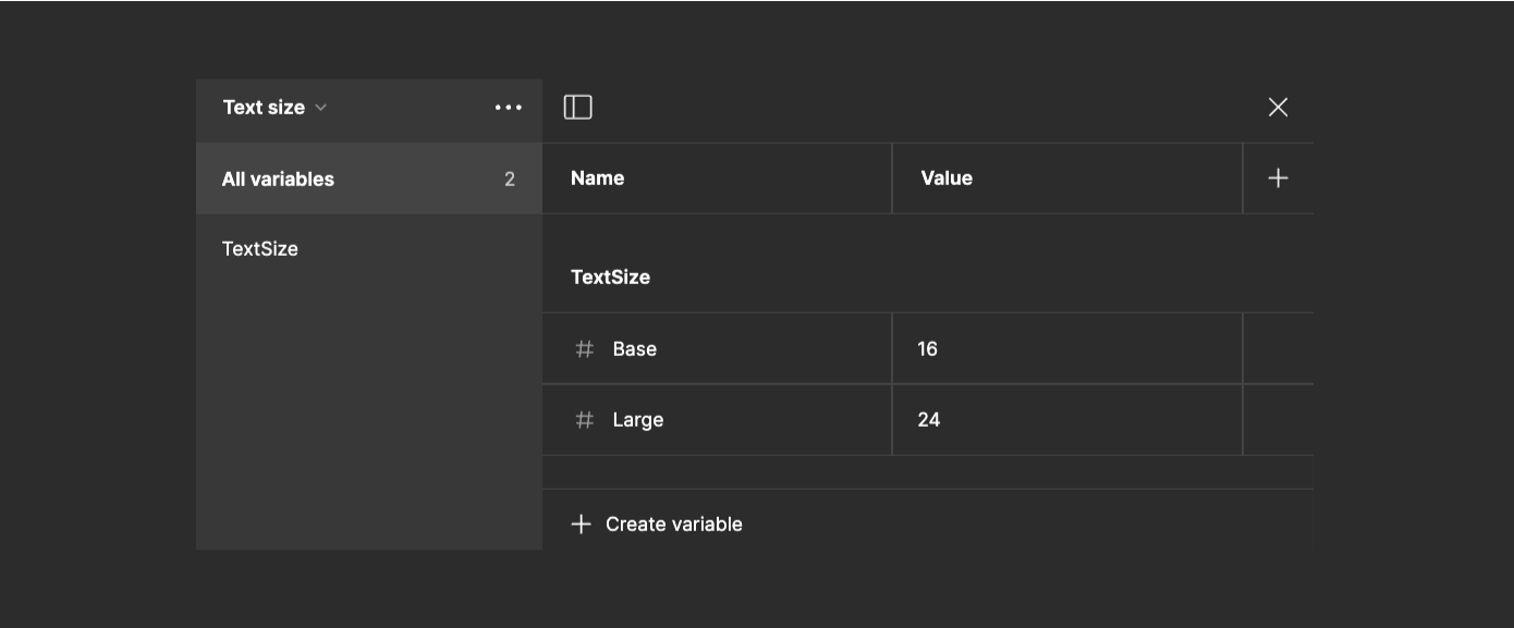
Create Text Size Category:
Add a new category named "TextSize." — Categories help keep your design tokens organized.
Add Variables:
Create two variables within "TextSize":
- Base: Set the value to 16 for the paragraph text size.
- Large: Set the value to 24 for the title text size.
Create Line Height Variables:
Tip: If you don’t see the variables panel, make sure you don’t have any elements selected i.e. click on the Page itself until you see this in the properties panel:
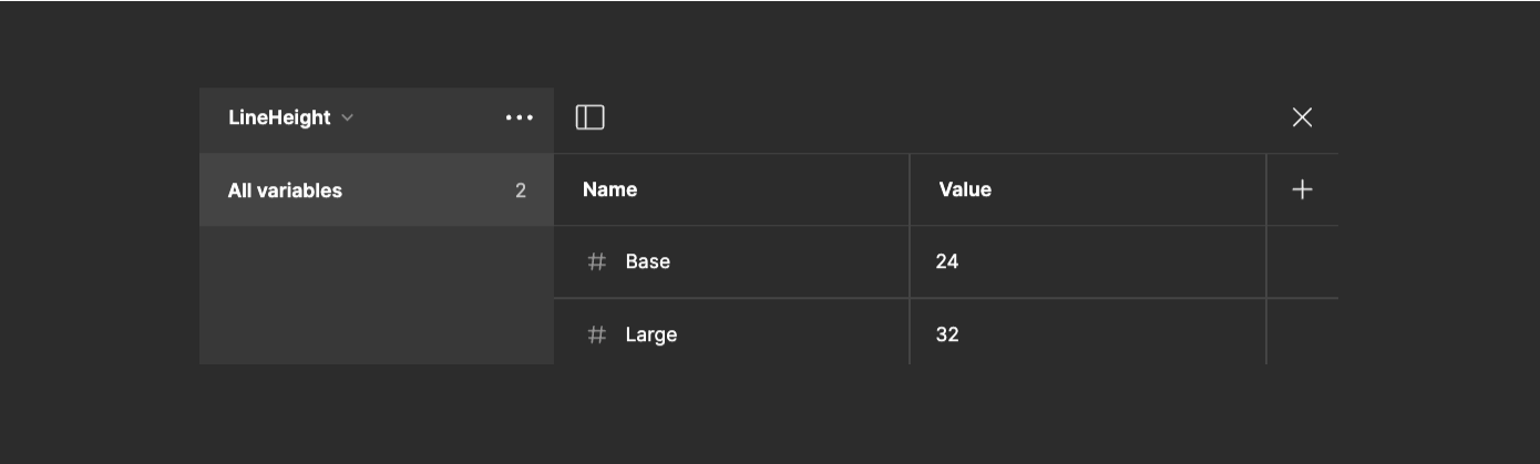
Create Line Height Category:
Add a new category named "LineHeight."
Add Variables:
Create two variables within "LineHeight":
- Base: Set the value to 24 for the paragraph line height.
- Large: Set the value to 32 for the title line height.
Step 2: Applying the Variables
Choosing the Text Element:
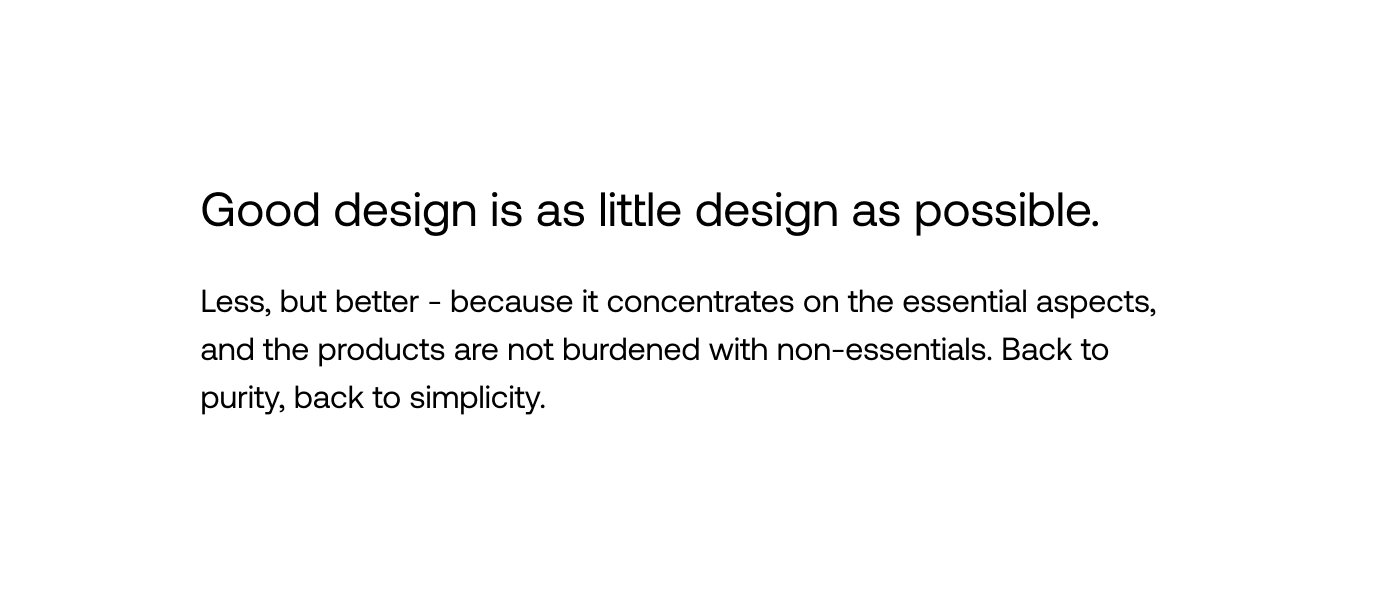
- Select the text element you want to style. In this case, we'll start with the title.
Set Title Properties:
- With the title text element selected, apply the
Largevalue from the "TextSize" category to set the font size to24. - Apply the
Largevalue from the "LineHeight" category to set the line height to32.
Set Paragraph Properties:
- Now, select the paragraph text element.
- Apply the
Basevalue from the "TextSize" category to set the font size to16. - Apply the
Basevalue from the "LineHeight” category to set the line height to24.
By defining these variables, you ensure a consistent typographic structure across your design system. These variables simplify adjusting text properties across multiple elements, enhancing both workflow efficiency and overall design consistency.
Pro Tips for Using Figma Variables
Use descriptive naming conventions
Choose clear, consistent names for your variables. For example, use "TextSize/Large" instead of just "Large" to provide context.
Organize variables into categories
Group related variables into categories like "TextSize", "LineHeight", "Colors", etc. This makes them easier to find and manage.
Use local variables for project-specific elements
For properties unique to a specific project, create local variables instead of adding them to your main variable collection.
Leverage variable modes
Use Figma's variable modes to create different states or themes (e.g., light mode and dark mode) for your design system.
Connect variables to components
Apply variables to your components to ensure consistency. When you update a variable, all connected components will update automatically.
Use variables for spacing and layout
Don't limit variables to just colors and typography. Use them for spacing, border radii, and other layout properties to maintain consistency.
By following these tips, you'll be able to create a more robust and flexible design system using Figma Variables, leading to more consistent and efficient design workflows.
→ Next up — Figma Styles. What variables are made for.
Here’s what to expect in this series:
- Variables: Learn how to use Variables to maintain consistency, ensure scalability, and keep your designs organized.
- Styles: Combine variables into styles for easy property application to an element.
- Components: Understand how to create reusable design elements to maintain uniformity across your project.
- Auto Layout: Find out how to create designs that automatically adapt to different screen sizes and how to optimize space usage. Coming up!
By the end of this series, you should have practical knowledge to make your design process and your workflow work for you better.