Many designers are familiar with design systems, what they are, why we use them, and how we use them, so I’ll fast forward to the juicy part.
Okay, so this article is about creating your design system, but there’s a twist. Before there is a design system, you should probably create a UI kit (since we’re UI designers). And that’s what the topic of this article actually is, creating your very own and shiny UI kit.
Why a UI kit? What’s that?
The UI kit, IMHO is the foundation of any design system (used in product design), and as such it’s important to start right. In the following paragraphs, I’ll try to post my experience with creating UI kits. I’m no expert, but let me give it a shot.
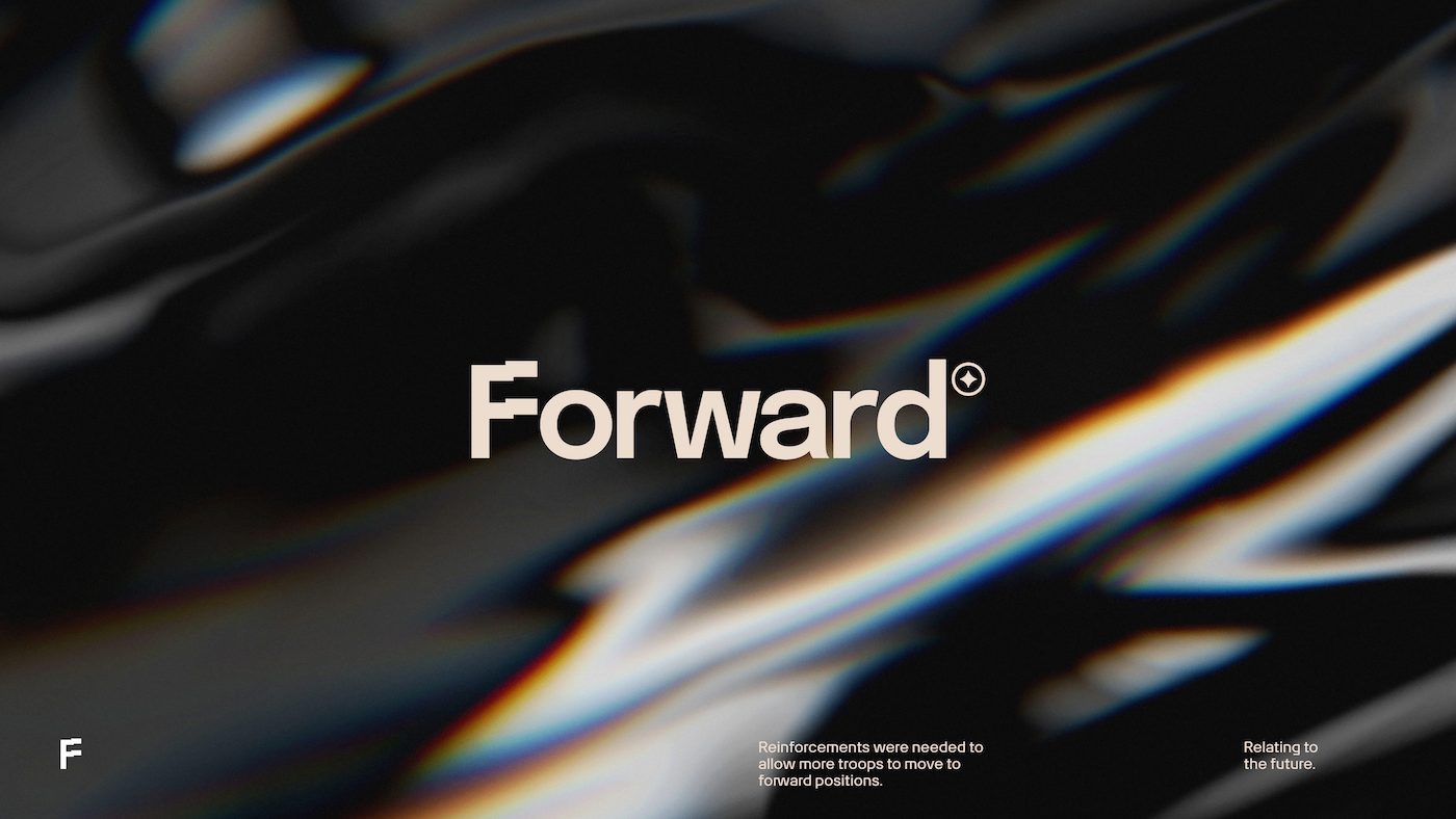
First things first. Let’s decide on what components we need to use. At PROTOTYP we have a basic “UI kit” called Forward that is usually the starting point for almost all projects. Forward evolves into a tailored design system based on the project's purpose and type, with components that are scaled, updated and improved as needed. The Forward UI kit provides a foundation that can then be customized and expanded on for each unique design system as requirements evolve over time.
What you need
Forward has a lot of components, but as a starting point, you don’t need everything — yet. To get started, focus on including the following core components:
- Buttons
- Type scale
- Forms Elements
- Colors
Now, let’s dive deeper into each of these core components in more detail.
Buttons
Buttons are usually the main interactive element on interfaces as we use them for actions. Let's start our exploration of core components with buttons. We all know how they work, but what do we need for a UI kit is widely discussed. I’ll try to cover our Forward button set and explain the reasoning why they exist as such.
Creating primary and secondary button styles is essential. The variations needed depend on use cases, but at minimum include primary and secondary buttons in small and normal sizes. This helps achieve a better visual hierarchy.
You'll also want to account for different states as well - you’ll have 5 states for each size and type. In the end, you should probably have something like this:
- Primary button small x 5 states
- Primary button normal x 5 states
- Secondary button small x 5 states
- Secondary button normal x 5 states
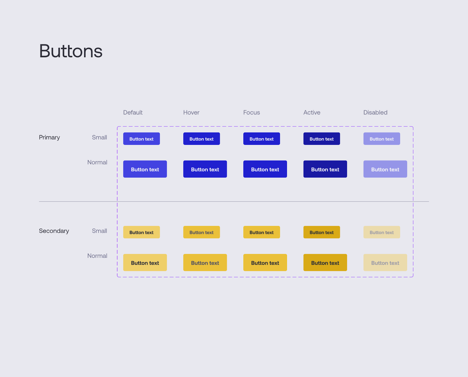
That's 20 basic buttons to start. Many design systems also include variants like outlined or ghost styles. When you factor those in, the total button count can grow quite large. For example, our Forward UI kit contains over 240 button styles to cover a wide range of needs
Type scale
A solid type scale is essential for any good UI kit. Our scale ranges from Micro to XXXX Large, with 10 sizes to accommodate varying text needs.
Depending on the chosen typeface, you may need to include additional weights like regular and bold.
Example type scales could include:
- Regular (Micro to XXXX Large)
- Labels (Tiny to Large)
- Inputs (depends on how many sizes of input fields you’ll have, but let’s say Small to Large)
- Buttons (also depending on the number of button sizes you’ll want to include; for our example, it’ll be two - Small and Normal)
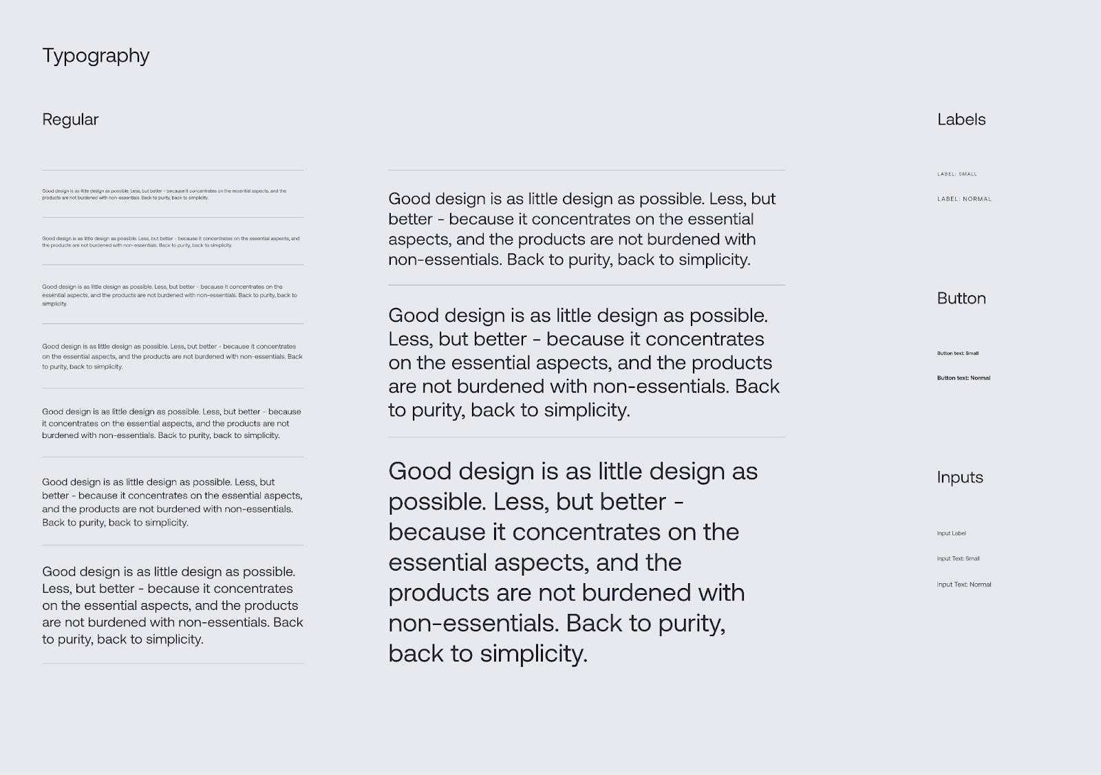
Your scale may grow as your project expands. For example, our Forward UI kit contains over 7 scales to thoroughly cover usage across products. While this sounds complex, well-structured type ensures every element has a clear purpose and place.
Form Elements
This section may not be something basic that’s needed in a starter UI kit, but almost every product has some inputs, checkboxes, and even radio buttons. The starting point could be the following:
- Input Field (multiple sizes and states, usually aligned with button sizes)
- Radio button (with states)
- Checkboxes (with states)
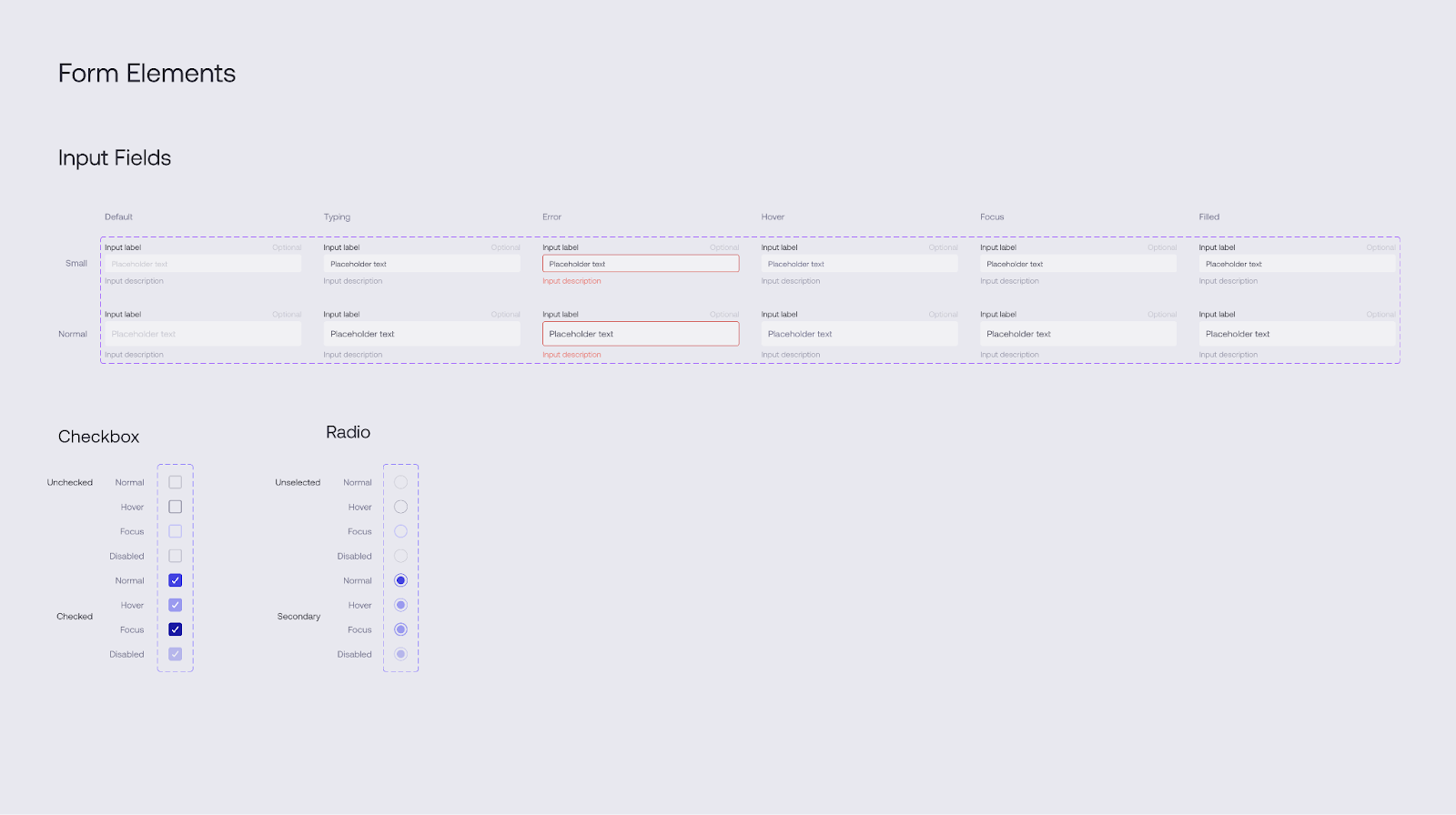
For radio buttons and checkboxes, use a single size to avoid unnecessary complexity.
Be sure to include all relevant states for each item. For example, you may end up with over 20 basic form elements to cover common interactions.
Larger kits like our Forward UI contain additional styles, sizes and states to accommodate more use cases out of the box. But this provides a good foundational set of form components to start.
Colors
Maybe we should’ve started the list with colors as colors are widely used across the entire UI kit. The reason behind having color last on the list is just to have a list of things you’ll need colors for - nothing more than that.
If you turn to things written before this section, you’ll see that you roughly need a color for each item, -ish. In the end, you end up with a list of colors that may look something like this:
- Text Color
- Primary color
- Secondary color
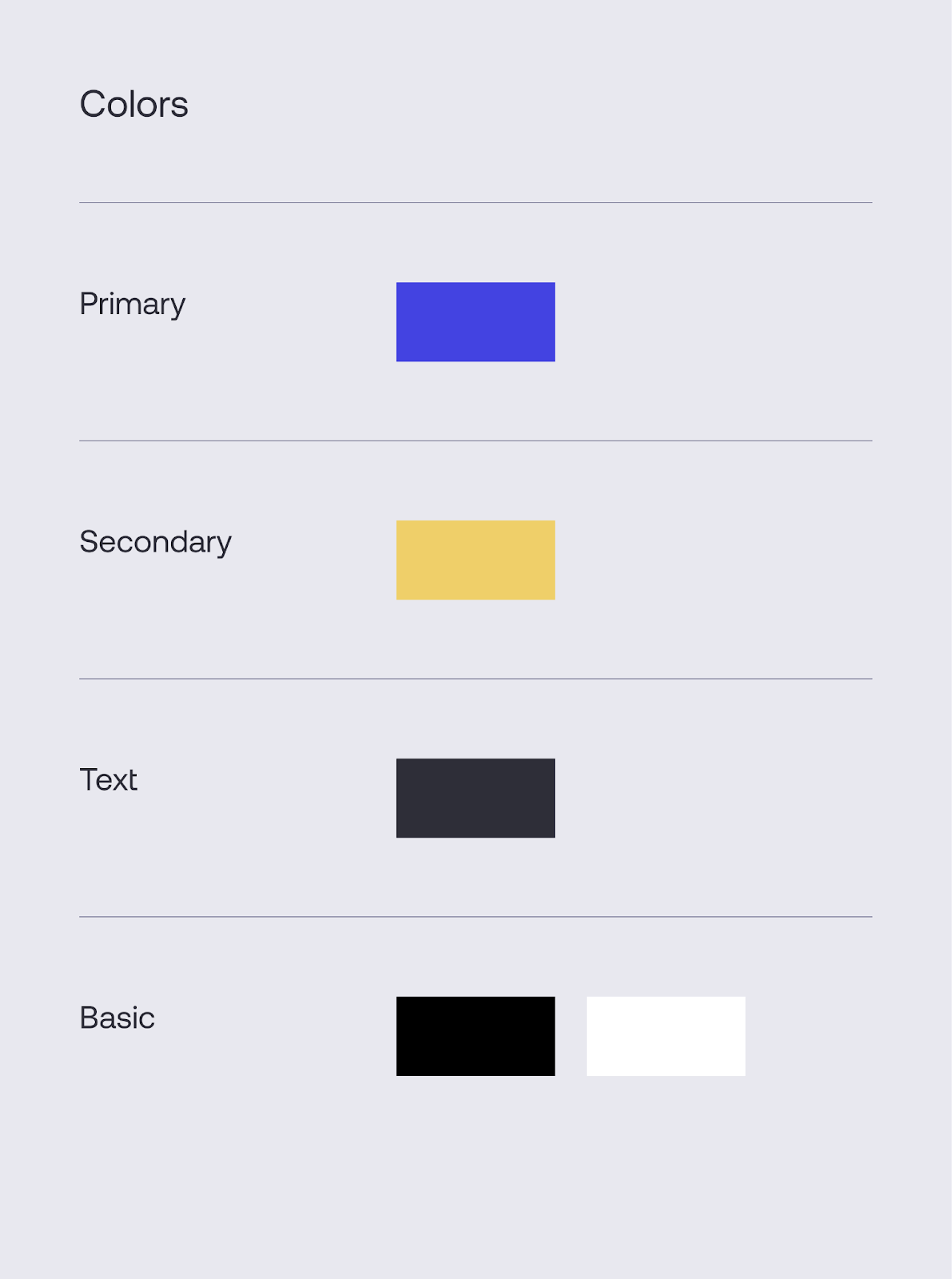
But remember that we have multiple states so you’ll need shades. A good starting point is having at least 5 shades of each color. That’s 15 colors to start with. You can easily expand that list by adding utility, background, border colors, etc. Forward has more than 50 colors as it stands today.
Wrapping things
This covers the core components to include in a starter UI kit. There’s always more that can be added and implemented. Every part can be expanded with states, sizes, styles, shades, etc. You can add elements such as icons, grids, modals… But as this was just to cover the basics, we’ll leave you with these ideas for expanding your own UI kit.
Also, be sure to use master components, variants, variables, styles, and other awesome things at your disposal if you work with Figma.
In summary, prioritizing a well-planned UI kit lays the foundation for a comprehensive design system tailored to your unique product requirements. As your project grows, your living style guide will adapt seamlessly while maintaining consistency. Start by gathering the essentials covered here, then continue expanding your vibrant and functional UI ecosystem.