Angular 18 introduced full support for Material 3, using design tokens implemented as CSS custom properties. This lets developers style components without relying on deep selectors or high-specificity overrides.
With Angular Material 19, the theming system gets a new API that makes customizing your app's look and feel much simpler. You get a clean, structured way to define colors, typography, and component behavior.
In this post, I’ll walk through practical tips for setting up themes quickly, and handling both global and component-level style overrides.
Here's what I used for this:
@angular/cli: 19.2.7@angular/material: 19.2.7
npm i -g @angular/cli
ng new angular-material-19 --style scss
When prompted:
cd angular-material-19
ng add @angular/material
Next, choose:
Nice — the Angular project is up and running. Now it’s time to define the theme.
You can stick with one of the predefined Material color palettes, or go custom if you want more control. The only required color is primary, while secondary, tertiary, error and neutral colors are optional but recommended for a more refined design, also specify path and type of file(css/scss).
To generate a custom palette, run:
ng generate @angular/material:theme-color
Define the Theme in styles.scss
Let's open the src/styles.scss file and define our theme.
@use '@angular/material' as mat;
// in case of using custom theme replace with the actual file path
@use './path/to/_theme-colors' as my-theme;

html {
	@include mat.theme((
		color: mat.$violet-palette,
		// or using custom theme:
		color: (
		  primary: my-theme.$primary-palette,
		  tertiary: my-theme.$tertiary-palette,
		),
		typography: Roboto,
		// or using typography map:
		typography: (
		  plain-family: Roboto, // most of the components text
    	  brand-family: Open Sans, // mostly for titles and headings
    	  bold-weight: 800,
    	  medium-weight: 400,
    	  regular-weight: 200,
        ),
		density: 0 // from 0 to -5
    ))
}

html, body { height: 100%; }
body {
	font-family: Roboto, "Helvetica Neue", sans-serif;
}
* {
	box-sizing: border-box;
	margin: 0;
}
With the theme in place, let’s add light and dark mode support.
We’ll hook into system color variables to set default background and text colors — no manual toggling needed.
(We’ll cover more about overriding system variables a bit later.)
@use '@angular/material' as mat;

html {
	color-scheme: light dark; // add color-scheme css property
	@include mat.theme((
		color: mat.$violet-palette,
		typography: Roboto,
		density: 0
	), $overrides: (
		surface: light-dark(#fefbff, #211f21), // override system variable
		on-surface: light-dark(#1c1b1d, #e6e1e3), // override system variable
	));
}

html, body { height: 100%; }
body {
	// Add default background and text colors
	background: var(--mat-sys-surface); // using system variables
	color: var(--mat-sys-on-surface);
	font-family: Roboto, "Helvetica Neue", sans-serif;
}
* {
	box-sizing: border-box;
	margin: 0;
}
Angular Material System Variables
Angular Material components rely on a set of system variables — defined as CSS custom properties via the material.theme mixin.
They come in three flavors: colors, typography, and elevation.
These variables follow the Material Design 3 spec, giving you a solid foundation that’s flexible and easy to extend.
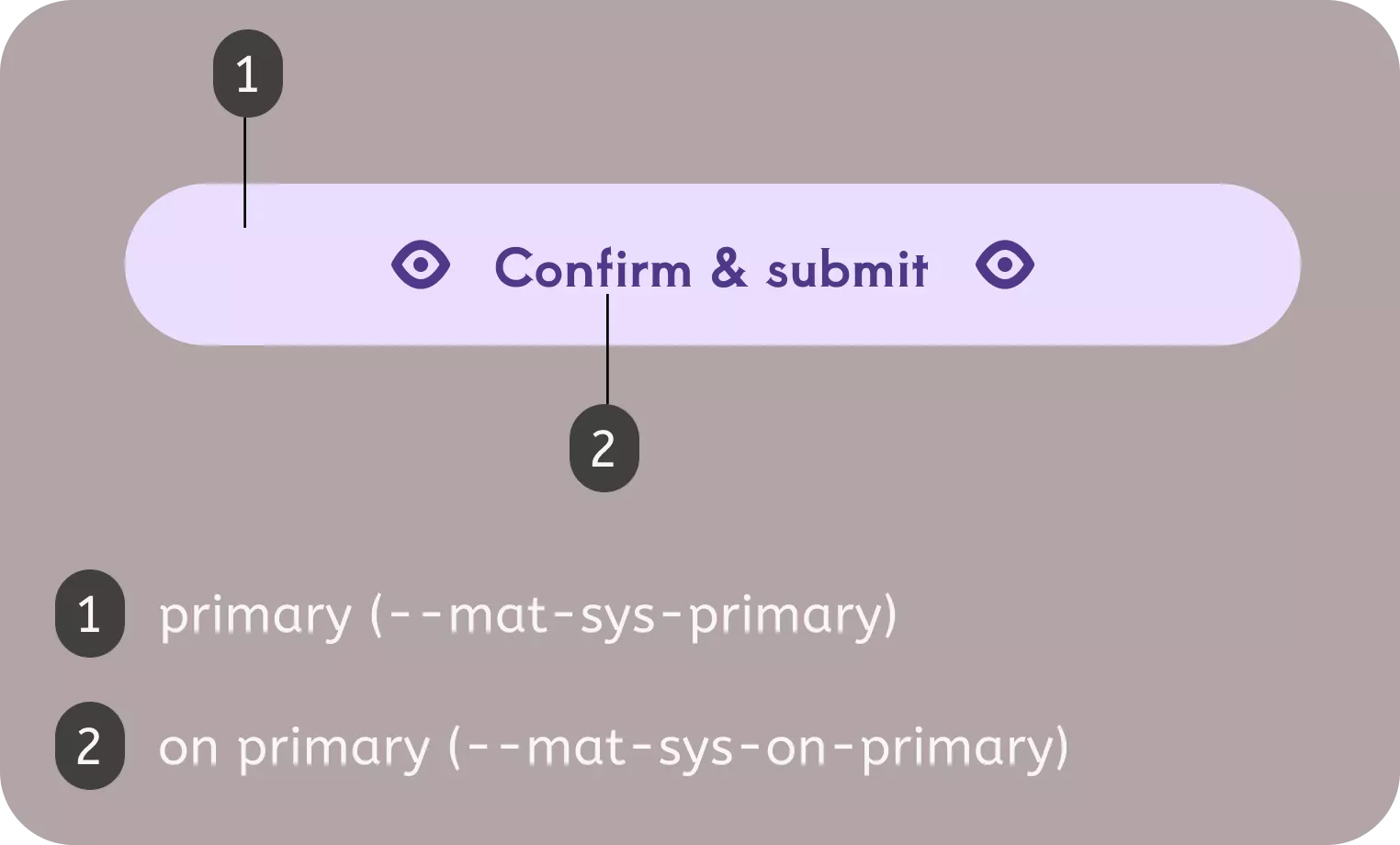
🎨 Colors system variables
Based on MD 3 color system.
Most commonly used color variable within Angular Material components:
—-mat-sys- color variable is usually paired with —-mat-sys-on- color which is used for icons, text, and other visual elements placed on an —-mat-sys- background.
Here’s an example of color system variables in use:
body {
	background: var(--mat-sys-surface);
	color: var(--mat-sys-on-surface);
}
Besides these, there are additional color system variables.
🅰️ Typography system variables
Based on MD 3 typography system.
Material Design 3 defines five typography categories: body, display, headline, label, and title — each with three sizes: small, medium, and large.
Next, we’ll walk through a few examples of how to use these typography variables in practice.
Using Angular Material typography system tokens recomended by Angular Material team:
h1 {
	font: var(--mat-sys-display-large);
}
h2 {
	font: var(--mat-sys-display-medium);
}
You can customize any typography system variable by appending keywords like font, line-height, size, tracking, or weight.
That said, directly overriding these system variables isn’t recommended.
I’ll show you the cleaner, more flexible approach using a mixin a bit later in the post.
🏔️ Elevation system variables
Based on MD 3 elevation system.
Material Design defines six elevation levels to help create depth and visual hierarchy in your UI.
Angular material tokens
To override tokenized styles, Angular Material gives you two powerful tools: system tokens and component tokens.
System Tokens
You can override system variables in two ways:
- Using the
mat-theme-overridesmixin - Passing an
$overridesmap directly into themat.theme()definition
Both approaches work — it really comes down to personal preference.
Option 1: mat-theme-overrides
@include mat.theme-overrides((
  surface: light-dark(#fefbff, #211f21),
	on-surface: light-dark(#1c1b1d, #e6e1e3),
	display-large: 500 3.5rem/4rem Arial,
	level3: 0 4px 6px 1px var(--mat-sys-secodary)
));
Option 2: Overrides inside mat.theme()
@include mat.theme((
	color: mat.$violet-palette,
	typography: Roboto,
	density: 0
), $overrides: (
	surface: light-dark(#fefbff, #211f21), // --mat-sys-surface
	on-surface: light-dark(#1c1b1d, #e6e1e3), // --mat-sys-on-surface
	display-large: 500 3.5rem/4rem Arial, // --mat-sys-display-large
	level3: 0 4px 6px 1px var(--mat-sys-secodary) // --mat-sys-level3
));
Component Tokens
Each Angular Material component exposes an override mixin that lets you tweak token-based styles — including color, typography, and density.
You’ll find the full override API for each component in the Angular Material docs, under the “Styling” tab (new in v19).
Here’s a quick example using the button override API for mat-flat-button — and you can explore the full list of button tokens here.
@use '@angular/material' as mat;

// Customize the entire application by targeting :root. If you prefer to scope
// the style, user desired selector or style file.
:root {
  @include mat.button-overrides((
	// background and label color
    filled-container-color: light-dark(#082234, #775c89),
    filled-label-text-color: #FFFFFF,
    // disabled background and label color
    filled-disabled-container-color: light-dark(#08223480, #775c8980),
    filled-disabled-label-text-color: light-dark(#FFFFFF, #A8ACB1),
    // label size
    filled-label-text-size: 14px,
    // color used for hover, focus and active state of button
    filled-state-layer-color: light-dark(#475A66, #8f719d),
    // opacity for button hover state
	filled-hover-state-layer-opacity: 1,
  ));
}
That’s a wrap on theming (for now)
With Angular 19 and full Material 3 support, customizing your app’s design is smoother and more flexible than ever. The new theming APIs, along with system and component tokens, give you the control to build consistent, polished UIs without messy CSS overrides.
In the next post, I’ll dig into advanced button styling: how to override tokens for different variants, handle states like hover and disabled, and apply consistent design patterns across your app.
Got feedback or want to share how you're using Material 3 theming? Drop us a note at hello@prototyp.digital.
Happy theming! 🎨